Thursday, February 13, 2014

Drawing 101. Basics are typically the 1st things to be forgotten

This article contains step-by-step images of the process I use to create realistic looking drawings, as well as tips I’ve picked up over the years which anyone can use to improve their drawing skills.
There’s a lot to cover, so let’s get started!

1. Make sure there’s a direct light source.

Before I started on the drawing for this tutorial, the first thing I did was set up a lamp pointing at my still life from just a few feet away. I also turned off all the other lights in the room to increase contrast and clarify each shadow.
Still-Life-Setup-lighting
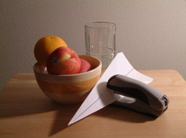
It’s extremely important to make good lighting for yourself when you’re drawing indoors. If you don’t have that strong directional light, you won’t be able to see the shadows and highlights and your drawing will most likely turn out gray and visually flat.

2. Use a viewfinder to set up your composition.
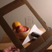
Cropping-ToolThis is the best way I’ve found to start a drawing, and it’s pretty easy too. All 
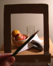
you need to do is cut a rectangle out of a piece of cardboard (like a shoebox lid) and use it to visually crop your subject.
Store-bought viewfinders work too. I’m just cheap.
Move the viewfinder around until you’ve found the best composition possible and tape it in place. Then draw the same size of rectangle on your paper.
When you look through the viewfinder, everything within the frame is what you’ll draw, and you can ignore the rest. Not only will it improve your compositions, but it will also help with the next few steps in the drawing process.

3. Start drawing objects that intersect the border.

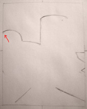
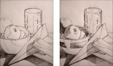
Always begin drawings along the edges first, before you do anything else. This will “anchor” your drawing in place and keep you from running out of space later on.
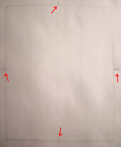
Sketch1-Blank-SquareTo make sure I’m starting in the right place, I usually make little marks halfway along each edge of my drawing, and then in the same place on the cardboard viewfinder.
You can’t see those marks on the viewfinder above, but on the paper to the left I’ve put red arrows to show where they are.
These marks give me smaller distances to measure between when I’m staring at my blank paper trying to figure out where along the edges I should begin.
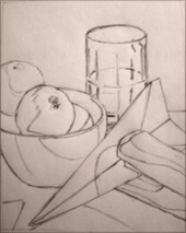
Sketch2-Draw-From-EdgesFor instance, the first line I made was the curved line on the left side of the rectangle. I looked through the viewfinder and took note of the spot where the outline of the orange crossed the edge of the border. It was just slightly below the halfway point between one of my marks and the top.
If I hadn’t had that mark, it would have been a lot harder to decide exactly where to draw the line.
(This idea is similar to using a grid, except there aren’t any lines running across the picture.)

4. Check line angles with your pencil.
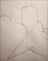
Measuring-AnglesI wanted to make sure that the two diagonal lines at the bottom of my drawing were correct, so I matched my pencil to the angles that I saw in the still life, and then moved my hand (while keeping the pencil at the same angle) in front of my paper and made sure the angles that I drew lined up.
This is a great way to get correct perspective lines, edges of buildings, or anything, really. No matter what I’m drawing this technique often comes in handy. Just make sure that you don’t subconsciously change the angle of your pencil to match your drawing.

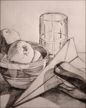
5. Work around each edge and then move inward.
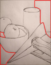
Sketch3-Draw-InwardOnce my drawing was “anchored,” I worked my way towards the center, extending all of my original lines until they connected with each other.
While you do this, you’ll generally want to keep moving all around the paper so that whole drawing progresses evenly. At this point in the drawing you should only be putting down the main outlines—no details or shading!
Draw lightly as well. When you get to tip #9 you’ll see why it’s a good idea.

6. Draw the negative space around the objects.

Sketch3-Use-Negative-Space-RedThis tip I learned from Drawing on the Right Side of the Brain by Betty Edwards. It’s stuck with me through the years and I use it every time I draw.
What you do is, instead of trying to draw a bowl or fruit, draw the negative shapes between objects instead. Does that make sense?
The problem with just thinking “draw that orange,” is that your mind will bring up non-visual ideas about oranges instead of letting you focus on the specific shapes in front of you.

7. Close one eye to flatten out the image.

I always squint with one eye when I draw, and I’m sure many of you do as well. This helps because it eliminates depth perception and makes the subject you’re drawing appear flat. Be consistent in which eye you use, though; if you switch eyes you’ll see the objects move slightly, which can mess you up.

8. Look back and forth as often as possible.

Sketch5-Outlined-CompletelySpending too much time looking at your paper—instead of your subject—won’t work, and it’s easy to understand why. If your eyes are always on your paper, you won’t ever be seeing what you’re supposed to be drawing.
So when you draw or paint, flick your eyes back and forth and never let them rest for too long in one place.
With practice, your eyes will do this naturally, but it’s important if you’re just starting out to do it purposefully at first to build up the habit.

9. Erase when you see something wrong.

Don’t just leave your mistakes there—fix them! If you can see a problem early on, your finished drawing will have it too. By then you won’t want to go all the way back and change everything, so get it right before you’re too far in.
What a lot of people don’t understand is that the most important partof any drawing is the initial line drawing. So always erase if you need to, because once you’ve got a good line drawing, you’re home free.

10. Shade from darkest to lightest.

shade-from-darkest-to-lightest.jpg
Once the line drawing is done, start filling in the darkest shadows first. Remember to look for areas of reflected light on the shadow sides of objects. Almost everything reflects light at least a little bit, and leaving those areas lighter will make your drawings much more three-dimensional. After your dark shadows are done, begin to work on the lighter tones all the way up to white.

11. Include a full range of values.

Sketch8-Most-Shading-DoneAt this point I was nearing the end of my drawing, so I wanted to make sure that the darkest shadow area was pure black, and the brightest highlight was white.
Having a full range of values in a drawing looks more natural, since it’s how we see in real life and it’s is easy enough to do by just adding more darks or using an eraser to pull out more highlights.
And even if there don’t seem to be pure black or pure white areas in real life, lie just a little bit and add them in anyway; your final drawing will look better.

12. Take a break before finishing.

When the drawing is almost finished, I usually take a breather, walk around, and then come back to finish it.
After being away for a while, you’ll be able see if there are mistakes or places that should be completed but somehow got overlooked. Fix those, and at the same time use your eraser to pick out the brightest highlights in your drawing.
Sketch9-Full-Range-of-Values-Large
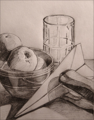
And there’s the finished piece. I hope you enjoyed this tutorial; it was fun for me to just use pencils for a change, instead of my normal oil paints.
When it comes to drawing it’s really never too late to improve, and you’ll get more out of it than just nice pencil work. I know that I learned to paint fairly easily simply because I already had a strong foundation in drawing.

Printable perspective grids


3 point perspective


The "Skinny" on shading

try this at home. 
 Are you sick of cross hatching and shading?

Grab the grease on the outside of your nose!


Pencil Sketching - Pencil Hardness Chart:
Pencils are rated based on their hardness and an HB is about the the middle of the hardness range. Typically you need to go to an art supply store or drafting supply store to buy harder or softer pencils. They usually don't have them in the office supply sections of the grocery store.
pencil hardness chart
Pencil Sketching - Shading Techniques
Usually when writing with a pencil we write with a sharpened tip. This sharp tip is also effective for shading in repetitive rows of lines in a technique called hatching. It's called that because it is not a continuous shading but rather rows of marks made side by side. An alternate way to shade with the pencil is to use the side of the sharpened lead and rub it back and forth. This gives a very different texture from using the tip.
When drawing pencil sketches, It can be difficult to get a clean hard edge with pencil shading. To accomplish this, use a second piece of paper as a shield or mask for the edge and then stroke the pencil off the shield sheet onto the drawing. If you run the pencil the other way, you risk slipping under your shield or crumpling the edge or the shield sheet
Pencil Shading Techniques
Pencil Sketching - Shading Techniques using Blending Tools
You can further blend this shading into a smooth tone by smudging and smearing it with a blending tool. You can find these paper blending stumps or tortillions in the art supply store, but some artist prefer to use cotton swabs or tightly rolled paper towel pieces. You may want to use your fingers, however you risk introducing oil from skin into your art and also will make your fingers dirty with graphite and then it gets hard to keep your paper clean. Some artist will scrape the graphite off the pencil lead with an X-acto knife or razor blade and smudge the graphite dust in to the paper with a blending tool.
Blending Stump for Blending Pencil
Pencil Sketching - Shading by Crosshatching:

Below is and example of hatching and cross hatching. Cross hatching is simply when you hatch over an area you have already hatched but you do it at an angle to the previous set of strokes. This has the effect of progressively darkening the area you are shading by covering more of the paper with each pass.
Crosshatching with Pencil
Pencil Sketching - Shading a 3D Box:
Below is and example of a shaded 3D box using mostly cross hatching to define the lighting on the box. in this example we presume a soft light coming primarily from the front and left. Therefore, the right facing planes are shaded darker than the forward facing planes. When light bounces off objects, it can get trapped in the corners and along edges where it no longer bounces towards our eyes. If you look at the corners of a room, you can see this subtle darkening. This is effect is called ambient occlusion and adding shading to your drawing to mimic this behavior of light in the real world adds realism to your drawings.
Pencil Shading a Box
Congratulations you have finished this online art lesson, Drawing Pencil

More books on design sketching

Good Books on Design Sketching (Updated October 2011)

File under:
Design Articles

Written by Brian Ling (Design Sojourn)
Mar 01, 2011

18 Comments


A warm welcome to you dear reader! If you have not already, why not subscribe to The Design Sojourn Newsletter and get my latest thoughts on Strategies for Good Design conveniently delivered right to your inbox? It's free! You can also follow me on Twitter and Facebook as well.

Thanks for visiting and please keep in touch?

Good sketching skills are important in any design process, and something truly needed in the design industry today. While working in the design industry, I have seen many young designers give up on sketching because they think they cannot do it.
The truth is sketching is an activity that requires constant practice to perfect. Therefore the will to practice is essential in helping you succeed, hopefully to the point where sketching becomes second nature to you. Or at the very least, you would get to the point where it would be easy to visualize a design in your mind.
One good way to improve your drawing is to use good sketches and sketch techniques to inspire and motivate you. So here are some design sketch references and sources that I have found both helpful and meaningful.


1. Design Sketching by Erik Olofsson and Klara Sjolen.

The excellent collection of design sketch explorations makes this book worth buying. It features 24 of the best designs from the Umea Institute of Design (Sweden), one of Europe’s best design schools. Well-known for their good design sketching skills, this book features many strong designs that have been done in various mediums (pens, pencils, markers) and computer programs like Photoshop and Illustrator.
The Design Sketching website provides sneak previews of the some of the chapters in this book. Their 2D rendering skills are so amazing that you will be tempted to order it!
design sketching


2. Learning Curves by Klara Sjolen and Allan Macdonald


From the same publisher that brought you Design Sketching, Learning Curves is a follow-up book targeted to take design sketchers to the next level by helping them to really learn how to sketch.

The book includes samples of sketching work of over 60 professional (product, industrial and transportation) designers from around the world. Structured more like a comprehensive list of hints and tips, designers can quickly find help in improving specific areas of their sketching abilities. You can find great tips such as sketching reflections, playing with line weights, constructing sketch scenes, creating exciting viewpoints and even workflow improvements such as generating more ideas via sketching etc.
The authors hope that this new approach is more meaningful and refreshing than the more usual tutorial route. However for people like me, I’ll just be reading it from cover to cover, and you know what? You should too.


3. Carl Liu’s Design Book

Possibly one of the best design sketchbook for industrial designers, Carl Liu’s book is a collection of his many design sketches from his career in design. Working with reputable design companies like Astro Studios and Disney, book show cases ideation sketches, presentations, exploded views and storyboards done with his signature quick sketch and rendering style.
If you can’t get your hands on his book, visiting his portfolio on his website, will definitely inspire you to practice your drawing further.
carl liu


4. Concept Design Books by Scott Robertson

Known for his strong futuristic product, transportation and city concepts, Scott Robertson creates great design work that exists far beyond anyone’s imagination. On his Drawthrough website, there are design sketching DVDs available, which shows vivid demonstrations of Scott Robertson sketching skills and covers topics such as perspective and proportion.
However if you want something to hold in your hand, his concept design books are a good alternative. Here are a few of his more popular ones.

DRIVE: vehicle sketches and renderings by Scott Robertson.


Start Your Engines: Surface Vehicle Sketches & Renderings from the Drawthrough Collection.


Lift Off: Air Vehicle Sketches & Renderings from the Drawthrough Collection.


5. Presentation Techniques by Dick Powell.

presentation techniques
Yep, it’s that Dick Powell. I believe this became an instant classic, as it was probably the first of its kind in the sketching or presentation skills category. This all-rounder book covers all presentation techniques starting from sketch, to marker rendering, and finally to presentation renderings. I actually got a chance to speak to Dick about his iconic book, and after his long embarrassed groan, he told me that after “hello”, every Industrial Designers he has met has told him they have read it. You should too.


6. Sketching: Drawing Techniques for Product Designers by Koos Eissen and Roselien Steur.


Now into its 5th reprinting, this successful reference tome houses a great collection of sketches and drawings contributed by Industrial Design professionals from all over the world. Not only that, there is a great collection of drawing tutorials like varying the line widths, vanishing points, and shading etc. at the beginning of the book.


7. Analog Dreams by Michale DiTullo

Michael DiTullo, famed Core 77 sketch guru, former Nike Design Director and currently Frog’s creative director, has self-published a collection of 120 design sketches from a decade of work as an Industrial Designer. In addition to his vast range of footwear sketches (something he is known for), he shares his thoughts on how to get better at sketch visualization and creating strong visual (design) languages. Buy his book at Blurb.
If you are interested to see more of his design process, check out his design visualization sketch he did exclusively for us at our sister site >think>draw>make>. Thanks for doing what you do Michael.


8. Sketching Videos from Feng Zhu’s FZD Design School

While technically not a design book, Feng Zhu sketch tutorials should not be missed for any aspiring design sketcher. He has a great range of inspirational concept sketches that has driven the environmental or character designs of movies and games such as Star Wars Episode III: Revenge of the Sith, Transformers, Command and Conquer 3, Sims 3 etc.
Check out their Youtube Channel as well: FZDSCHOOL

Furniture drawing book

http://www.frameweb.com/books/sketching

Materials for sketching:

 http://www.idsketching.com/thesketchlab/materials-guide/

Materials Guide

Pens

For those starting out with their sketching, pens are a good way to getb etter faster. Using a pen makes you commit to the lines you are throwing down. To become a great athlete it requires practice and training…don’t fool yourself, its the same thing here. There is no such thing as a “magic pen,” there is only the designer who has worked it out so much that he/she produces their own magic.
Here are some pens that have proven to be great for a variety of different styles and lineweights.
Before you read on, know that this is by no means a comprehensive list. Infact, we believe in always looking for and trying out new pens.
If you’re interested in trying out some new pens, check out Jetpens.com

Basic Ballpoint Pen

bic
They all feel different, so you’re going to have to dig in, buy a few, and see what you like. Fortunately, most ballpoint pens are super cheap, so buying a few may be like buying one of the more expensive pens on this page. I recommend Bic Ballpoint Pens, because they’re cheap, and low commitment. You can get them at Amazon pretty cheap, or at any decent office supply store.
Ballpoint pens are the one pen in this group with the flexibility to be applied with a varied line weight all with the same pen. With changes in pressure while sketching, you can sketch light guidelines and later heavier outlines all with the same pen.
Ballpoint pens tend to bleed with most alcohol based markers. there may be exceptions but I haven’t found any yet. Chartpak markers (or AD Markers), however, do not bleed when applied over or with ballpoint markers.
If you’re hell bent on using ball point pens, try sketching lightly with the ballpoint pen, then applying the marker. Let the marker dry and then add line weight with the ballpoint over the markered areas.

Felt Pens/Permanent Ink Pens

Felt tipped pens, unlike their ball-pointed cousins, typically come with a fixed line weight or tip width. This means that to achieve varied line weight, multiple pens are required to do so.
For Beginners, this is the kind of pen we typically recommend. Why? Well there are no mess ups with these pens. There are ways to work with your mistakes, but a certain level of commitment and confidence is required and generated by sketching with these pens. Just try it, and you’ll see what I mean.
triplus
The Triplus Fineliner by Staedler used to be one of my favorites. The tip hardly ever if at all dries out, which I like, and they come in a variety of colors. You can get them at Amazon
sharpebullet
Sharpies tend to bleed with marker as well, though the bleeding I have found to be dependent on a variety of factors. You’ll just have to test that out for yourself. These are good for outlines and heavier line weights. They come in a variety of lineweights and colors, so it’s up to you to experiment and see what looks and feels good.
razorpoint
I used to like these Pilot Razor Points alot more, but now, I prefer the Fineliner. They are about the same, but the fineliner tens to be juicier with a darker line. The Razorpoints don’t bleed with marker (which is always a plus) but the fineliners do with certain brands. Again – experiment and figure out what works best for you. My favorite paper for these is good old tracing paper. it’s cheap and somehow I find they look better on tracing paper.

Gel Ink Pens

hitec
Ah, the holy grail of pens. They are expensive, but I really like these. Of all the gel pens I have tried, these are the ones I like best. They don’t bleed with any markers and they have a nice feel to them. Plus, they are refillable. The downside is they are a japanese pen. If you are lucky, you can find them in higher end or specialty book or pen stores, but I get mine online. Jetpens.com is a good place to start looking for these gems.
When all is said and done, it’s up to you to find what works best. Bottom line is, find something you like and be the best at using it. Then, if you feel comfortable, feel free to try something else. It’s better to master one before you move on to another.

Pencils

Prismacolor brand is by far the most widely used type of pencil in id sketching. There are two main types that you can play with. The Prismacolor Verithin is a harder lead that allows you to do light line work. The thicker regular Prismacolor pencils are nice to get that thick line weight and contrast. There are a variety of colors available so experiment with what works for you. Really, the brand isn’t critical nor it the color, it’s all about how you use the tool to create a visually captivating and interesting sketch or presentation.

Verithin Pencils

verithinblack
Verithins are a subset of the prismacolor brand of pencil that feature a harder core than their softer counterparts. They hold their tip fairly well and allow you to get nice crisp lines when sharpened properly. It’s always good practice to have a few of these on hand for adding details to your sketches. I try to keep 3-4 sharpened and on hand for those times I need to use them. Try them and see what you think.
verithinblue
The indigo blue tend to be the de-facto standard with car designers (correct me if I am wrong). Again, color isn’t critical, but there’s something special about this tone.
verithinbrown
Brown! Yes! Again, play with the colors and see what you like. I’ve even used violet and red pencils for sketching before. Sometimes it’s helpful to switch tools or colors when sketching and you find yourself in a creative rut. I find that it helps the ideas flow when some variable changes.

Regular (Thick) Prismacolor Pencils

Prismacolor Pencils have softer lead than the Verithin pencils and personally I prefer them. With the regular prismacolor pencils, you can get high contrast with lower effort. What I mean is, you can press on the paper less than you would with the Verithin pencils and achieve thicker and richer line weights. The softer lead also allows for different shading techniques.
prismablack
Typically again, I limit my choices in color to black and indigo blue, but feel free to experiment and find something you like. There are several colors to choose from, but these may be the hardest to find at times, as they are a favorite of many a designer.
prismablue

Mechanical Pencils

Mechanical pencils give you the advantage of being able to sketch with pencils on the go. I personally hate manual sharpeners and always exclusively go for a nice electric auto stop sharpener. They may cost more, but they are worht every penny.
Most mechanical pencils come with standard lead refills, but with a little bit of effort, you can find colored lead-like refills for your mechanical pencil. Personally, I find that anything under 0.9mm in thickness is insufficient due to incessant breaking when a little pressure is applied. The 0.9mm leads hold up well and travel well.
mechanical

Sharpeners

Pencil Sharpener
To help keep your pencils sharp, choosing the right sharpener is key. The cost a bit more than your average manual sharpener, but something like this (I’ve had it for 3 years now) will last a long time and get those prismas nice and sharp and ready for the next stroke. They are extremely useful when sharpening multiple pencils as well to have at the ready when sketching.

Paper

Like most everything we suggest here, paper is a topic you want to feel out for yourself. Here are a few thoughts and suggestions to get you started… First off, let us make this claim…PAPER MATTERS! You will quickly notice that different papers can give you different results (even when using the same pens or pencils). The reason for this is mainly because of the “tooth” of the paper. Some papers have more texture or tooth while others have finer surfaces. Some pens are absorbed better with more tooth, some are fine without much.

“Sketch Pad”

Don’t be fooled by “sketching papers” or pads. Most of the time pads with paper that are made or labeled for sketching are actually made for artists doing pencil, chalk, or conte crayon sketches. While these types of pads can work great for an id sketch/idea book, they are most likely not what you want for a presentation type sketch.

Tracing Paper

Remember back in elementary school when you would draw an airplane, car, robot, etc, and someone would say, “WOW…did you trace that?” That was THE question by which all kids were subjected to for judgement of artistic ability. Now however, you have earned the ability to pull out your tracing paper and use it for quick overlays of ideas and sketches…we promise.

Newsprint – Paper that can save you paper!

Sometimes you want to sketch out a lot of ideas without having to burn through lots of money of expensive paper. This is especially true for those 
students out there. One good way to have your paper go a long way is to get some newsprint. Newsprint is really affordable and can often be purchased by
the roll or in large pads. This paper is a little rough, but can allow you to workstuff out before you go to the good stuff.

Try Smooth paper

As a suggestion, try out papers that are smooth. Usually they are little more
expensive but very much worth it. There are a couple of reasons why you might
want to go with a smoother paper, such as color laser paper or marker paper.
One reason is obvious…the smoother the paper the smoother you will be able to
throw down lines. The second reason is for scanning. Eventually you will probably
want to scan your sketches in to archive them digitally. Having them on a smooth,
bright white paper will make them much better for the scanner to read.

Analog to Digital

In our digital world it has become increasingly easier and more feasible to do without paper. The same is becoming true with industrial design sketching, and sketching in general. If you have the means to sketch digitally you can save yourself a lot on pens, paper, and be a little more efficient (control z). That being said we still appreciate a nice sketch done the old-fashioned way!

Markers

Ah…. Choosing the right markers. I once counted how many I had and had over 200. I promise I have less now and didn’t pay for them all. I was obsessed for a while with markers in all their varieties. All brands are all different, but one thing is for sure – picking the right colors can be tough and sometimes downright intimidating.
marker
Let’s start with a simple black and white scale. We’ll move on to color later on. . .  (spectral purists need not read on) hehe. My Disclaimer – I am no expert on color theory, but I have tried out alot of markers and have learned a few tips in my tinkering.

Basic Grayscale:

Gray markers are a good starting point for playing with value, and getting used to using markers.
gs
This scale runs from a deep black 100% to a 10% gray to the right. Chances are your monitor may either pick up all the subtleties of the scale or not. Either way, think of this is as a scale of grays or values in 10% increments. Now, you really don’t need to go buy a set of 12 grays. Here’s why – When using markers, if you let them dry a little after applying them, then reapply some more marker, you can get a darker value with the same marker. Works on most papers but especially marker paper.
Really, all you need for a decent range of values is three markers, with each marker 20% away from each other. What I mean is for example, 10%, 30%, and 50% grays or 30% 50% and 70% gray markers. Why?
Well, take a look at this sketch or any decent sketch as a matter of fact. Now, squint your eyes and take a look at it. You should be able to see an area of highlight where the light is the most intense (in this case, the top of the box), a mid-tone (the left side of the cube) and a shadow tone (the dark right side of the cube).
The shadow could be considered an even deeper value, but in this case, I have used a 70% grey marker.
step12
Ahhhhh that’s more like it. Pick 3 values from the grays – warm or cool depending on your preference (personally I prefer cool grays for most product sketches and warm grays for some special applications) Nice and simple right? Just follow the 20% apart scheme and you should be fine with picking the grays. The scale below represents a 70% gray, 50% gray, and a 30% gray value scale with each 20% away from the next in value.
gs2

Colored Markers:

With colors, you’ll need to stay within the same hue before messing with value. By hue, I mean REDS, ORANGES, or BLUES for example. You could also think of it as color temperature. (again, this may not be 100% correct, but it’s how I think it works)
Again, try to pick three markers that are each 20% apart in value and represent a highlight value, midtone value, and a shadow value. You can get a basic set of markers at Amazon.com, and expand from there.
spec
So if you’re picking red markers for example, you may want to stay close to something as shown below.
brightness
Shadow, Midtone, and Highlight values. I have a deep red, a midtone red, and a lighter pink for the highlight color.3
Depending on the brand of marker you choose, these values may differ. I highly recommend testing the colors with markers in an art store for example before committing to buying them online. That way, you can find colors that are similar enough in hue and different enough in value that all work together.
Confused? Just remember, if you’re not sure what to do:
  1. Squint your eyes
  2. Check the values
  3. Make sure that the markers are within the same range in hue (For colors)
  4. Test test test before you buy them.
So, if you’re on a budget and not planning to amass a collection of 200+ markers like I have, stick to three for each color range and experiment. Find what works for you and use these tips to help simplify your choice in markers.

Digital Sketching

Sketching has gone digital. The capability to sketch and quickly manipulate is a great ability designers can take advantage of through technology. There are some great tablets available on the market for a variety of different needs. We recommend going with Wacom products since they are so involved with developing for the creative industry. Check out some of the tablets below.
If most of us can remember where our passion for design started, we might naturally trace it back to our love of drawing and sketching. With all of the advances in digital tools and equipment, sketching is now even more fun and more forgiving. It is so nice to be able to emulate some of the best looking techniques from the old school in the digital space (and even take it to the next level). We think sketching will continue to evolve in the digital realm and it will become industry standard to know and use these tools.

Wacom Cintiq 21ux ($ 1999 USD)

21ux
The Wacom Cintiq 21ux is a big beast of a drawing tablet. The Cintiq line from Wacom offers the ability to sketch right on top of a lcd screen. They offer excellent sensitivity and pressure response and have a nice feel. If you have never tried one, it can be a little different for the first few times. The larger Cintiq here is made to sit and live on a desktop. It can tilt and rotate but the weight and size of the unit can be a bit cumbersome to wrestle with. If you are planning on getting cozy with this thing, make sure you have an environment with an optimal lighting situation as glare can become an issue. If you like a lot of room and lots of screen real estate, this unit is for you!

Wacom Cintiq 12wx ($ 999 USD)

12wx
The Wacom Cintiq 12wx is a breath of fresh air to the Cintiq lineup. This being the newest Cintiq, it is also the lightest and most compact. Don’t let the image here fool you though, this baby comes with a mess of cords. If you are all about portability however, this is the unit for you. The 12wx is great for maneuverability and can be rotated with ease on your lap. Coming in at a grand less than it’s big brother, the price point makes good sense for beginners and students.

Wacom Cintiq Intuos 4 ($229 – $789 USD)

intuos4
Wacom has just recently released the Intuos 4. The Intuos line is different from that of the Cintiq in that-even though sharing the same pressure sensitivity- you do not sketch directly on a screen. With the Intuos line you have to become a little more aquainted with a hand/eye coordination routine that can be a little annoying for some. Don’t get me wrong these are definitely nice tablets! New on the Intuos 4 they have added an ability to switch (rotate 180 degrees) depending on right or left handed preferences to accomodate more users. Also new is a finger-sensitive Touch Ring to speed up workflow.

Wacom Bamboo ($79 – $129)

bamboo
If you are on a tight budget and need a tablet for light duty, the Wacom Bamboo line has some interesting options. Made for the novice, the Bamboo line is more about simple and easy. With the Bamboo you don’t have all of the pen tip pressure sensitivity of the beefier models and it’s a little lighter on other bells and whistles as well . For manipulating photos and perhaps light illustration work, this unit will probably be just fine. If you are determined to sketch a lot and go for a more digital workflow however, you will need to step it up to the Intuos line of products.